Sans serif fonts offer a remarkable degree of versatility, making them suitable for a wide range of design applications:
- Branding and Identity: A well-chosen sans serif font can be a powerful tool for establishing a brand’s identity. Their clean lines and modern aesthetic often resonate with contemporary audiences, making them ideal for tech startups, fashion brands, and other forward-thinking businesses.
- Web Design: Sans serif fonts, one of the best website font, are a staple in web design due to their excellent readability on screens of all sizes. Their clean lines and clear letterforms ensure a positive user experience and enhance navigation.
- Editorial Design: From newspapers to magazines, sans serif fonts are commonly used for headlines, subheadings, and body text. Their versatility allows them to adapt to different content styles and layouts, ensuring a visually appealing and engaging reading experience.
- Marketing Materials: Whether it’s brochures, flyers, or posters, sans serif fonts can be used effectively to convey a message, grab attention, and drive action. Their modern aesthetic and clean lines make them suitable for a variety of marketing collateral.
A Brief History of Sans Serif Fonts
The roots of sans serif fonts can be traced back to the 15th century, when early printers experimented with typefaces that lacked the decorative serifs found in traditional Roman letterforms. However, it wasn’t until the 19th century that sans serif fonts truly gained prominence, particularly in industrial signage and advertising. The clean lines and bold appearance of these fonts made them ideal for conveying information quickly and effectively in a rapidly urbanizing world.
The 20th century marked a significant leap forward for sans serif fonts. The Bauhaus movement, with its emphasis on functionality and clean design, championed sans serif typefaces as a symbol of modernity. Iconic fonts like Futura, Helvetica, and Gill Sans emerged as pioneers of the sans serif genre, setting the stage for their widespread adoption in various design disciplines.
Choosing the Right Sans Serif Font: A Strategic Approach
Selecting the perfect sans serif font for your project requires careful consideration. Here are some key factors to keep in mind:
- Brand Identity: Consider your brand’s personality, values, and target audience. Choose a sans serif font that aligns with your brand’s overall aesthetic and messaging.
- Readability: Ensure the chosen font is legible, especially at smaller sizes. Look for fonts with clear letterforms and appropriate spacing.
- Versatility: Consider how the font will be used across various platforms and mediums. A versatile sans serif font should work well in both print and digital applications.
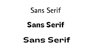
- Hierarchy and Contrast: Use different weights and styles of sans serif fonts to create visual hierarchy and emphasize important elements within your design.
- Experimentation: Don’t be afraid to experiment with different sans serif fonts to find the perfect match for your project. Consider trying multiple options and seeing how they impact the overall visual appeal and message.
In Conclusion
Sans serif fonts have evolved from simple utilitarian typefaces to become a versatile and powerful tool for designers. Their clean lines, modern aesthetic, and emotional impact make them an essential part of the contemporary design landscape. By understanding the nuances of sans serif fonts and their strategic application, you can unlock their full potential and create compelling visual experiences that resonate with your audience.